

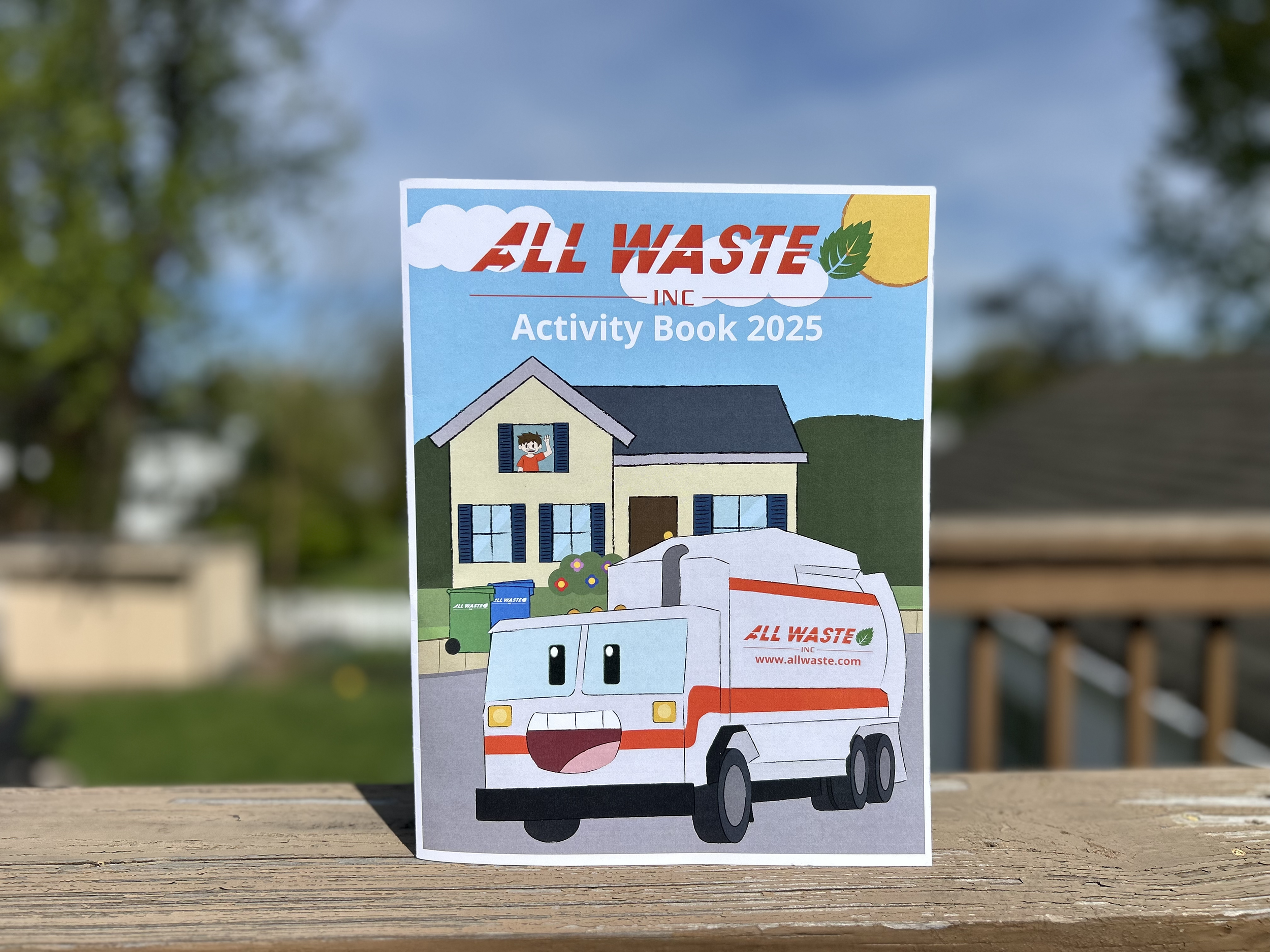
All Waste Inc. 2025 Activity Book
The All Waste Inc. Activity Book is designed to entertain children from ages 4 and up.
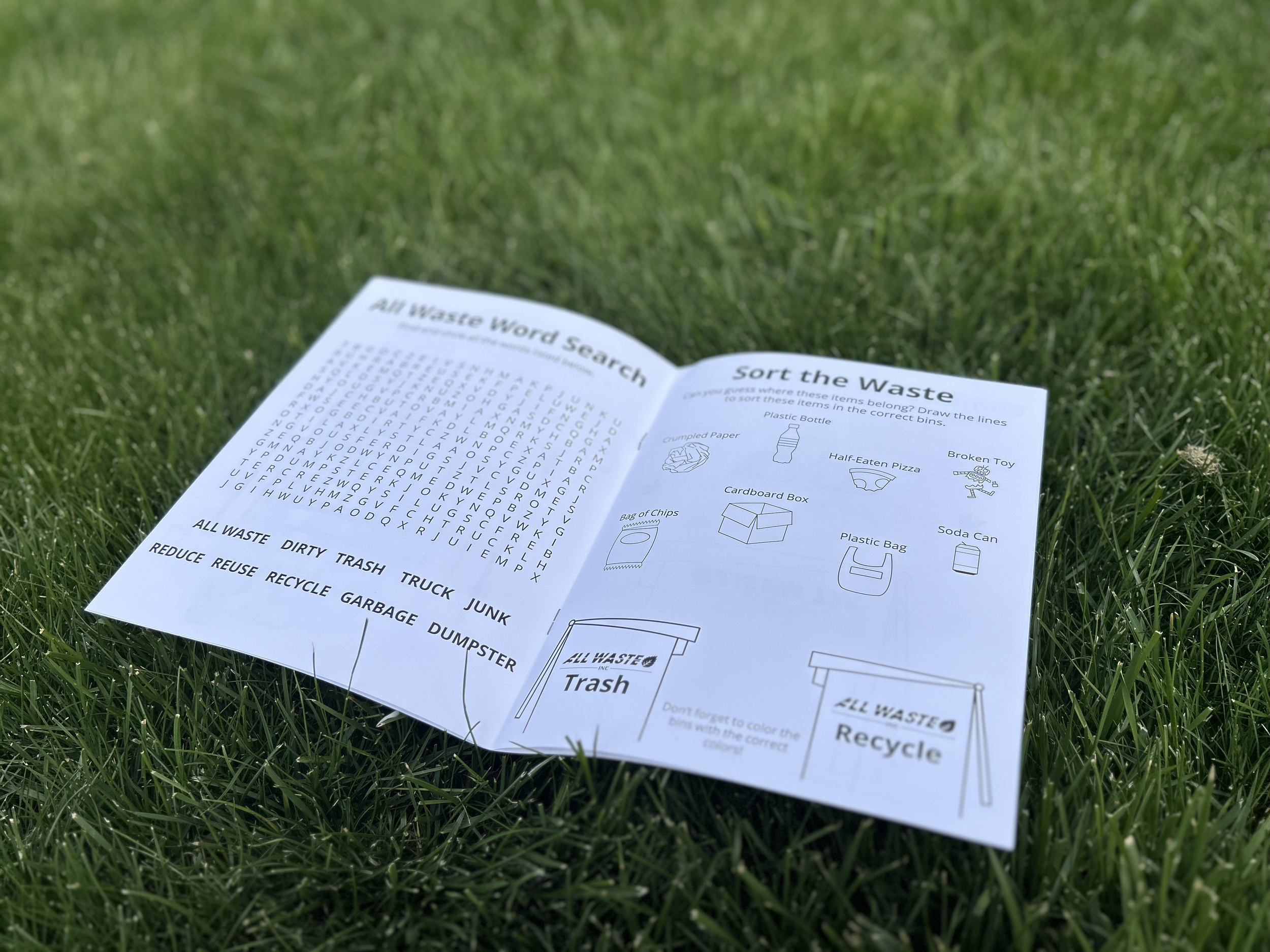
The activity book features color pages, word searches, mazes, connect-the-dots, trash sorting, and options to write a letter to your garbage man.
With additional feedback, I designed all the graphics, from the front to the back of the book, and fun, creative ideas that will entertain children for hours.
The Challenge
I was tasked with designing a children’s physical activity book for the All Waste brand, despite having limited prior experience with this format. To approach the project effectively, I drew on my background in print design while conducting research into activity book conventions, target audience expectations, and opportunities to align content with the brand’s messaging.
The objective was to create an engaging, educational experience for children ages four and up—one that would introduce concepts of waste management and recycling in a fun, accessible, and visually cohesive way. This also required developing front and back cover concepts that would resonate with a young audience while maintaining brand consistency.
The Process
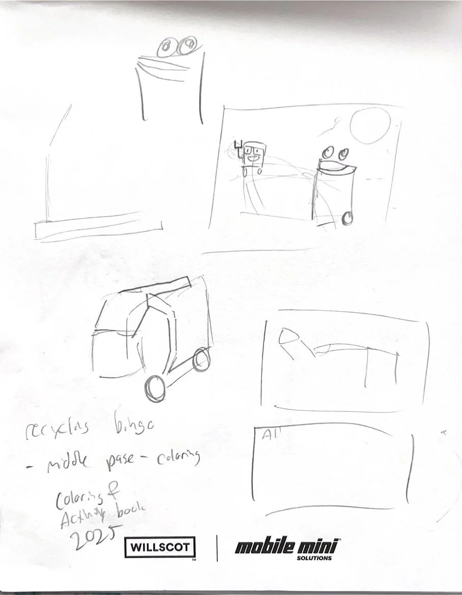
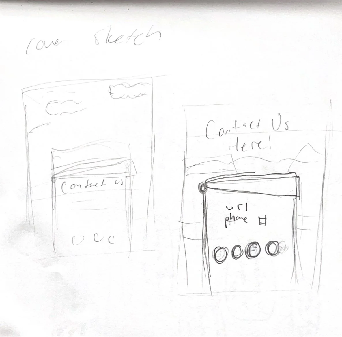
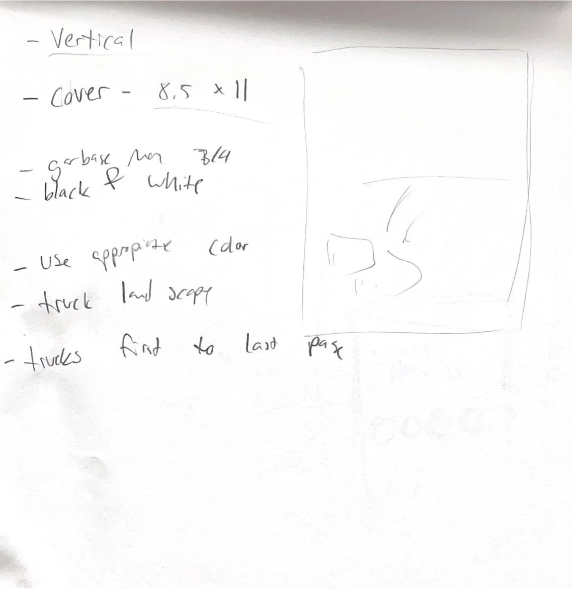
After confirming the book’s dimensions and requirements, I began by sketching multiple cover concepts that incorporated the company’s logo, color palette, and key visual elements. I ultimately developed a garbage truck mascot to serve as a central, child-friendly visual. This character became a defining element of the project and was later produced as a standalone sticker to accompany the book.
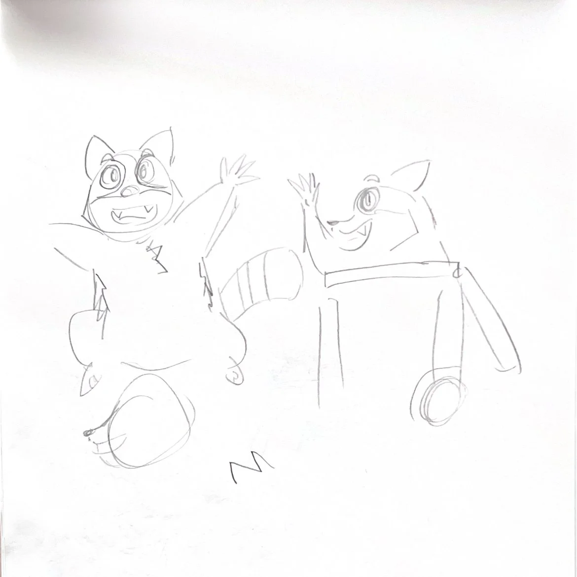
Additional discussions included introducing a raccoon mascot. While the cover composition was already visually dense, I integrated this character into one of the internal activities to maintain balance while still expanding the book’s personality.
Designing the interior required careful consideration of both creativity and technical execution. Using Adobe Illustrator, I developed activities that were both engaging for children and efficient to produce digitally. After research and iterative feedback from stakeholders, I finalized a selection of activities, including word searches, mazes, connect-the-dots, coloring pages, sorting exercises, and a customizable letter activity.
Other Challenges
Midway through the project, the book’s format shifted from a horizontal to a vertical orientation. This required reworking layouts and rethinking compositions across all pages. The front cover proved especially challenging, but through iterative adjustments, I successfully adapted the design to the new format.
Additional issues arose during the proofing stage, including oversized graphics and inconsistencies in color application that were not immediately apparent in the digital files. I addressed these by refining scale, improving visual balance, and ensuring all elements reproduced accurately in print.
The Outcome
The final printed activity book successfully met both design and engagement goals. It was well received internally and proved popular with children, who interacted with it both at home and within the community. Employees shared the book with their families, and sanitation workers distributed copies along their routes, reinforcing the brand’s connection to the community in a meaningful way.
Key Learnings
Design decisions must account for real-world scale; elements that appear subtle on screen can become dominant in print.
Flexibility is essential—adapting to changing specifications is a critical part of the design process.
Concepts that don’t fit within one solution can often be repurposed effectively in another context.
Reflection
This project expanded my understanding of designing for younger audiences and reinforced my interest in creating physical, interactive media. I look forward to applying these insights to future opportunities, particularly in projects that combine education, branding, and print design.