

Legacy Theater Motion Graphic
The Problem
Legacy Theater is a nonprofit community theater based in Branford, Connecticut. While the organization is deeply rooted in its local community and has a solid history of programs and performances, its social media presence lacked consistent branding and visual design.
Their website had a minimal color scheme, but their Facebook and Instagram featured a completely different brand design, which contained more graphic-heavy and vibrant elements. However, unlike many other nonprofits, Legacy Theater regularly posts about upcoming events and programs.
The challenge for our group was to develop a rebranded visual design campaign that maintained the aesthetics of a "historic theater" while maintaining consistency within their brand design.
The Process
Rebranding Legacy Theater
We began by designing a new brand identity for the theater that we could all use across our different parts of the campaign:
Color palette: Using coolors.co, we landed on five key shades. We kept the existing red and yellow (adjusting the hues slightly) and added black and gray for bold text elements. To replace the outdated cream color, we introduced a fresh sky blue as a neutral balance to the palette.
Typography: For body text and general content, we chose Poppins — clean, elegant, and easy to read. For titles and headings, we added cursive-style fonts to give them that classic theater flair that the organization leaned towards.


My Role in the Campaign
I volunteered to create a motion graphic for Legacy Theater’s social platforms. Despite being nervous, since I hadn’t worked in motion graphics in about a year, I knew I could create a short animation that would resemble the theater aesthetic that the original brand heavily leaned towards.
Research & Concept
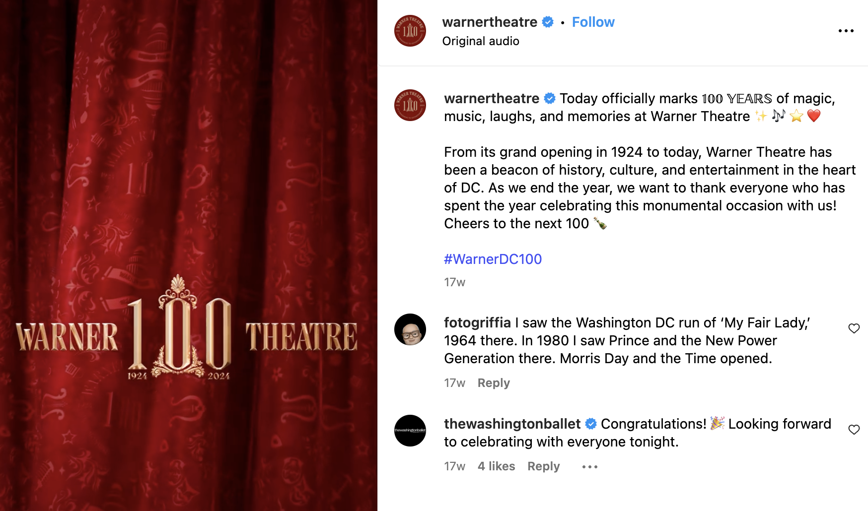
I then browsed social media pages of other nonprofit theater groups and noticed how most motion content consisted of edited video clips of actors or directors talking about their upcoming plays, with very few accounts using animation or design-based GIFs. It wasn’t until I watched
the 100-year celebration reel from Warner Theatre’s Instagram account that an idea struck me: a GIF based on the opening of a play when the curtains would draw back to reveal the backdrop with the organization’s name on it.
Ideally, this motion graphic would be utilized on Legacy Theater's social media or its website, whether pinned to the accounts or displayed on the home page.
It's intended to be a fun, short graphic that introduces the organization while also preserving a traditional theater vibe.


The Prototype
Creating the First Draft
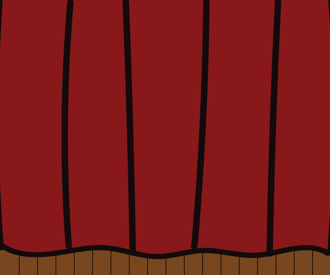
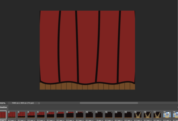
I started in Adobe Illustrator and designed each graphic, including the curtains, stage floor, spotlights, and a plain backdrop, using our new color palette. Then, using the timeline feature in Adobe Photoshop, I animated the curtain motion frame-by-frame.

Receiving Feedback
While I was proud of the first draft, I asked my professor and classmates for feedback, and their suggestions completely reshaped the final product:
Swap out my illustrated curtain with a realistic video using a greenscreen to better maintain the traditional theater aesthetic
Use Adobe After Effects instead of Photoshop to increase flexibility and improve animation quality.
Redesign the backdrop to appear more like a hand-painted wooden set to seem less flat
Change the font from Poppins to something more ornate: Learning Curve for “Legacy” and Didot for “Theater” to add contrast and readability.
Final Product
Using a greenscreen curtain video from Pixabay, I inserted my new graphics into After Effects and carefully adjusted the timing and transitions to ensure that it’s seamless and evenly spaced. The result was a short, looping curtain-opening animation revealing the theater’s name, which can be used as a social media intro or homepage element.
The Solution
Presentation & Feedback
When our group shared our campaign with fellow designers, the feedback was very encouraging. People appreciated our consistent brand design and thought our redesign honored the theater’s legacy and enhanced the aesthetic it was going for. My motion graphic in particular stood out since it provided movement compared to other content that contained still images
Key Takeaways
I gained valuable experience working as part of a brand design team
I re-learned and refined my skills in After Effects after a year-long hiatus
I developed more confidence in my motion graphics design process when receiving feedback.
I realized that redesigning an existing brand isn’t just about creating something new, but it’s also about preserving the heart of what already works while leveling up what doesn’t.
If I could do it again:
I’d explore how to better balance older and modern visual designs, and try creating more motion graphic that advertise events or cast announcements.