

Spuds Your Way Social Media Campaign
The Problem
Spuds Your Way is a small restaurant in Hamden, CT, that has a slightly active yet sporadic social media presence. Their posts on all platforms mainly focused on business hours and participation in upcoming events across Connecticut.
Looking at their official website for more content, I immediately noticed how bold yet unpolished the layout was. It was overly simple yet obnoxious, with the color palette being black, white, and a bright yellow that takes up most of the website.
For my project, which involves organizing a fictitious social media campaign for a real small business, I wanted to redo Spuds Your Way’s social media presence into something more vibrant, active, and appealing to current and future consumers.


The Process
Competitor Analysis
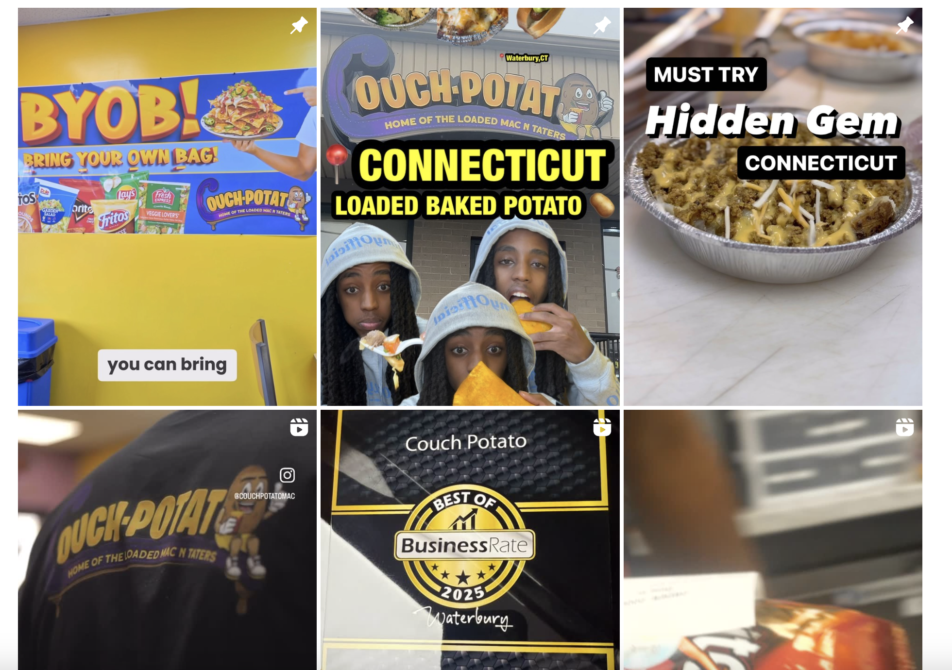
I started by researching other restaurants, and discovered Couch Potato in Waterbury, one of the few baked-potato competitors in Connecticut. Unlike Spuds Your Way, their Instagram was more active and engaging, using Reels and memes alongside announcements for menu updates and events. They also pinned popular content and partnerships, which kept their feed active and appealing.

Target Demographic
I created three user personas based on who I imagined would eat at Spuds Your Way:
Students from nearby Quinnipiac University
Local young professionals
Professors or staff at the university
Each persona had distinct online behaviors and content preferences, which helped me shape the tone and types of content I would design.

Planning the Campaign
My campaign would include:
2 email blasts
A Facebook ad
A redesigned Instagram grid layout
For inspiration, I researched examples of restaurant emails, ads, and grid layouts that matched a casual but fun brand voice. I didn’t note any specific account but instead built a mental checklist of what I should include, such as bold imagery, event info, menu highlights, consistent brand voice, and much more.
Visual Direction
While I didn't intend to have a consistent color palette, I did want them to be similar, so I stuck with using yellows, blacks, whites, oranges, and reds. The same could be said of fonts and typefaces, as they all varied depending on the content.
The Prototype
Email Blasts
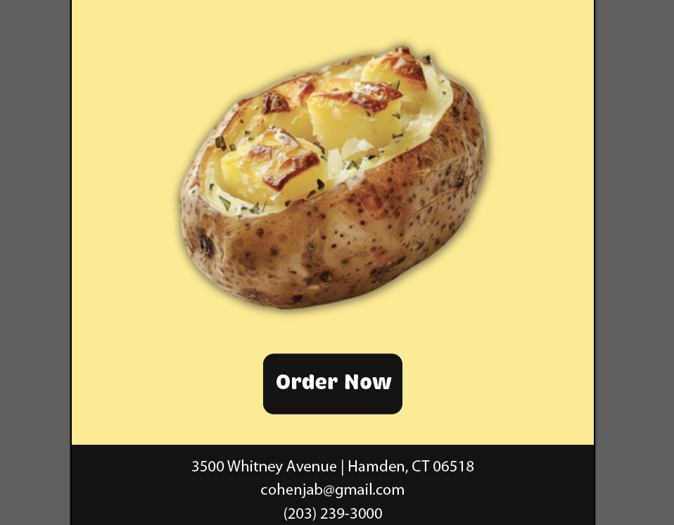
I started by drafting a couple of rough sketches to get a general idea of the layout and content I wanted to go with, then, on Adobe Illustrator (600x1200px canvas size), I designed two fictional promotions:
A spicy baked potato called “Hot Potato”
A smaller-sized option called “Spuds Mini”
Both featured bold text (STIX Two Text to echo the website’s type), minimalistic yet visually-appealing graphics, and social media icons with custom coloring. I even added a drop shadow and footer details for an added polished effect.


Facebook Ad
This was the quickest and simplest piece to design. I took inspiration from a McDonald’s India campaign featuring bold text and background lines common in fast food posters. I recreated a circus tent-style pattern in Illustrator using two colors, paired with the chewy Brevia font and a baked potato image with a white outer glow behind it.


Instagram Grid Layout
Originally, I planned just one post, but after receiving feedback from my peers, I realized how lacking the existing feed was. So I redesigned the entire grid layout:
Center column = Instagram Reels (highest engagement)
Side columns = static posts: menu items, promos, behind-the-scenes content
I used real images and custom graphics to simulate what a vibrant, yet playful and active feed could look like for Spuds Your Way.
The Solution
Peer Feedback
When presenting my campaign to my peers, they generally agreed that the restaurant brand is more visually appealing than what they had originally envisioned and can envision themselves interacting with their content in the future.
Takeaways
This was my first attempt at building a full campaign, and it taught me how many moving parts are involved, including the research, strategy, and design process behind it. If I could improve anything:
I’d design a newsletter or redo their website if I had more time
I’d use fewer flat colors in the email blasts and include more texture and patterns
Next Steps
Overall, I was pleased with how the social media campaign turned out and will be using this as a benchmark and learning experience for future campaigns with actual clients.